Plandroid - Graphical Air Conditioning Design and Quoting Software
Plandroid Help Documentation
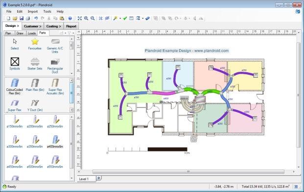 |
The Design Canvas
The main program page is the Design page. This is where you create the system design itself. On the right is the design canvas where you create your design. In the design canvas you directly manipulate objects with point-and-click, and drag-and-drop.
Mouse Controls
Hold down the right mouse button and drag your mouse to drag the canvas (moving your view of it), and spin the middle mouse wheel*, if you have one, to zoom in or out. Holding down the Alt or Ctrl key while spinning the mouse wheel will pan the canvas vertically or horizontally respectively. Dragging the middle mouse button will perform a zoom-to-box, and performing a single click with the middle mouse button will fit the design to the window. (You can also use the toolbar zoom buttons or the keyboard shortcuts + or - to zoom, and 0 to fit the design to the window).
* Note: Using your middle mouse wheel to zoom requires a standard mouse configuration, and may not work for all mouse configurations.
Tool Tabs
On the left is the design toolbox, with four tabs of its own: Plan, Draw, Loads and Parts, each with its own set of tools. Each tab determines which type of object can be selected with the mouse, for example you must select the Loads tab to be able to select load zones, and the Parts tab to select parts. (The exceptions are notes and their leader arrows, which, while created on the Draw tab, are selectable from any of the Draw, Loads, or Parts tabs.)
Tips on how to use whichever tool is selected are shown in the status bar, on the bottom of the window.
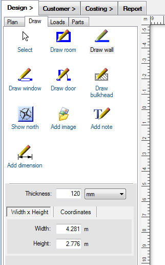
The Plan Tool Tab
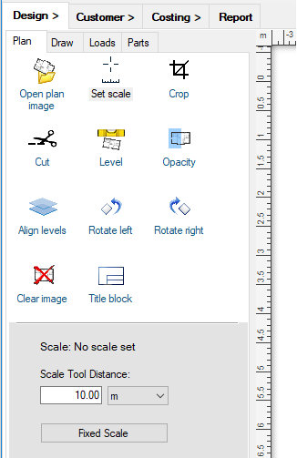 |
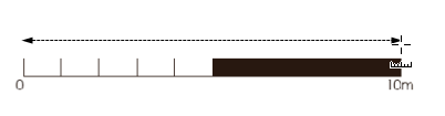
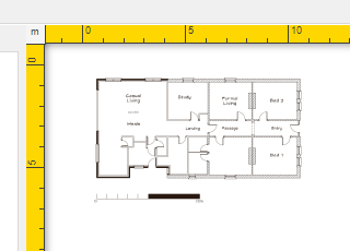
The Plan tab has all the tools you need for manipulating a floor plan image. You can open a plan image file with the Open plan image button, and scale the image with the Set scale tool. This sets the scale of the underlying floor plan image - it has no effect on anything else (walls, zones, parts, etc.) drawn on the canvas. Be sure to scale the image before adding any other items to the plan. Unscaled plans are indicated with yellow highlighted rulers on the canvas. To set the scale, simply enter a known distance into the Scale Tool Distance field, and then drag the tool (holding down the left mouse button) along the corresponding length on your floor plan image that has that distance. Your floor plan is then scaled.
 |
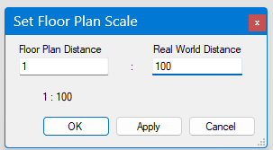
Alternatively, you can use the Fixed Scale button to set the image scale directly to a particular fixed scale, as architectural PDFs are often drawn to a known scale.
 |
Any time you are working with an unscaled plan image, the rulers will be drawn in yellow as a reminder that you need to scale it.
 |
If you open a PDF document with multiple pages, then additional controls are shown allowing you to browse to the page that you wish to use.
Other tools in this tab allow you to cut and crop the image, perform a fine rotation if the image is slightly skewed with the Level tool, set the plan image opacity (transparency), align this level against an underlying level (for positioning penetrations), rotate the image 90 degrees left or right, clear the plan image, or add title blocks. Note that applying opacity to a plan image may result in a noticeable reduction in performance, especially for large image files.
Holding the [Ctrl] key with any of these tools will activate the background colour picker tool, which you can use to choose the canvas colour from the floor plan image. Selecting outside of the floor plan image will always select white.
Hold down the P key at any point to show only the plan image by hiding everything else in your design.
The Draw Tool Tab
 |
The Draw tab has simple tools to let you draw your own plan layout. These may be modifications to the plan image you need, such as a planned extension, or you could draw the entire plan yourself directly from your sketch notes.
Selecting
Click on the Select tool ( ) at any time to clear a draw tool and return to the select tool. You can also
tap the [space], [Ctrl] or [Shift] key to toggle between the select tool and the last draw tool you have chosen.
Point and click the select tool to select an item. Drag the tool to draw a box that selects everything inside the box.
If you hold any control key ([Ctrl]/[Shift]/[Alt]) while you are doing a box-select, then the new selection is added
to the current selection instead of replacing it.
) at any time to clear a draw tool and return to the select tool. You can also
tap the [space], [Ctrl] or [Shift] key to toggle between the select tool and the last draw tool you have chosen.
Point and click the select tool to select an item. Drag the tool to draw a box that selects everything inside the box.
If you hold any control key ([Ctrl]/[Shift]/[Alt]) while you are doing a box-select, then the new selection is added
to the current selection instead of replacing it.
Draw Tools
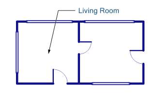
The Draw tab has tools for drawing rooms, walls, windows and doors. The Draw bulkhead tool draws a hatched area representing a bulkhead. The tool creates rectangular or (with the [Alt] key held) polygon areas, and can be customised for colour and hatch style. The Show north button displays a selection of compass images that you can choose from and which you can rotate to indicate north on your plan. With the Add image tool you can also add your own custom images to your plan, which you can move, resize and rotate. These could be anything from images of your own custom components, to data spreadsheets copy and pasted from Excel. The Add note tool allows you to add text notes directly onto the plan (double click on an existing note to edit it), or if you drag the tool, you can also add leader arrows to your notes. Leader arrows and notes are very customisable so you can make them look exactly how you want. You can also add a note by copying text and pasting it directly into the canvas. With the Add dimension tool you can add a length dimension line to indicate any distance on the design.
 |
For most drawing tools, holding down the Control [Ctrl] key while you are drawing will override snap-to, holding the [Shift] key down will force the program to draw in multiples of 45° angles, and pressing the Escape [Esc] key will cancel the draw action (pressing [Esc] again will cancel the tool). Other keys can have other effects, for example pressing the [Alt] key while drawing a door will flip the side the door opens to, or when drawing a wall it will draw as an arc instead of a straight line.
Hints on how to use each tool are shown in the status bar when you select or use the tool.
 |
If you are using a tool that has parameters which can be set (for example the wall thickness), the appropriate settings panels beneath the toolbox will become active. You can also enter either the width and height or the coordinates of a wall or room manually in the fields beneath the tools to directly create walls with precise dimensions. You can likewise select an existing wall and edit its properties in these fields.
Double-clicking on a wall with the Select Tool will add a new point to the wall. Double clicking on an existing point will remove it. Dragging a connected wall while holding the [Ctrl] key will separate the wall. Selecting a wall while holding the [Alt] key will also select all the wall sections (including doors and windows) that lie in the same line as that wall.
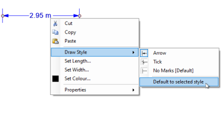
Double clicking on a Dimension arrow will let you directly set its length, as will using the context menu item Set Length.
Any item or group of items can be flipped with the toolbar button flip tools
( ).
This is useful when you want to mirror your design, reflect an image, or change the
way a door opens after you have drawn it, for example.
).
This is useful when you want to mirror your design, reflect an image, or change the
way a door opens after you have drawn it, for example.
Add Image Tool
An image can be simply dragged and dropped into the canvas, or you can use the Add image tool to specify a location and then browse for the image file to add. The Add image tool can also be dragged to draw a box - the added image will then be scaled to fit within the box. You may wish to use an image with a transparent background - if so, create your image in a format which supports transparency, such as .gif or .png. Note that adding very large images can significantly reduce the responsiveness when manipulating the canvas, and it is usually best to add such images after first creating the rest of your design.
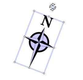 |
A custom image (or a compass image, as shown above, which is also a type of custom image) can be rotated or resized by dragging
any of the circular handles ( ) which
appear when the image is selected. A selected image is drawn with a rotation handle above the image which, when dragged, lets
you position the image at any angle you wish. The rotation will automatically snap-to a 90o angle, unless you hold
down the Control key [Ctrl]. To constrain the angle to a multiple of 45o, hold down the Shift key
while rotating the image. The six smaller resize handles can be dragged to resize the image. Holding down the Control key
[Ctrl] while resizing will resize symmetrically about the image centre. Double clicking the image will reset it back
to its native size.
) which
appear when the image is selected. A selected image is drawn with a rotation handle above the image which, when dragged, lets
you position the image at any angle you wish. The rotation will automatically snap-to a 90o angle, unless you hold
down the Control key [Ctrl]. To constrain the angle to a multiple of 45o, hold down the Shift key
while rotating the image. The six smaller resize handles can be dragged to resize the image. Holding down the Control key
[Ctrl] while resizing will resize symmetrically about the image centre. Double clicking the image will reset it back
to its native size.
You can directly set the physical size of an image (that is, the size it will appear on the plan) with the context menu item Set Image Size. Another context menu item, Convert to Plan Image, allows you to convert the selected image to a floor plan image.
Snap-To For Tools
Tools have snap-to behaviour - that is, they will automatically connect with (snap-to) each other when you draw them, and walls will snap-to 90o angles, making drawing easier. To draw without snap-to, hold down the Control key [Ctrl]. To draw a wall at exactly 45o, or to draw a square room or load zone, for example, hold down the Shift key while you are drawing. If you want to turn off snap-to for an extended period, you can use the user-defined snap-to disable key (by default this is [Caps Lock]).
The Snap-To Grid
The snap-to grid can be shown in the canvas by pressing the G key or with the Toggle Grid toolbar button
( ). When the snap-to grid is displayed, anything that you place
on the canvas will snap to discrete points on the grid, which helps to keep your design aligned. Holding down the
Control key [Ctrl] always overrides snap-to. The snap-to grid settings can be controlled in the program
options.
). When the snap-to grid is displayed, anything that you place
on the canvas will snap to discrete points on the grid, which helps to keep your design aligned. Holding down the
Control key [Ctrl] always overrides snap-to. The snap-to grid settings can be controlled in the program
options.
 |
The first tool in any toolbox is the Select tool, which is used to select objects in the canvas. You can also get the Select tool by cancelling any other tool with the Escape (Esc) key, or by selecting (left-clicking) the background in the toolbox. To select more than one object at a time in the canvas, hold down the Control (Ctrl) key while making your selection. Clicking and dragging the Select tool on the canvas background will draw a selection box, and will select everything inside that box. To delete objects, simply select them and press the Delete key.
You can switch from the Select tool to the last used draw tool and back again by briefly tapping the Ctrl key, the Shift key, or the Spacebar.
Context Menu
With most tools, you can open a context menu on the current selection by pressing the right mouse button. The context menu will give you a list of actions that are appropriate for the current selection, as well as extra information about the selected objects.
 |
Other tools have a dedicated context menu that give options that are only applicable to that tool. But they are all opened by clicking the right mouse button.
The Loads Tool Tab
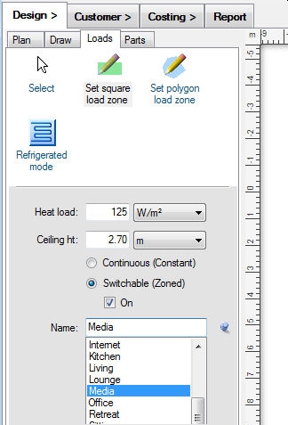 |
The Loads tab allows you to very quickly specify heat load zones from the plan, either as rectangles or polygons. By setting the heat load in kilowatts per square metre, for example, you have then instantly calculated the heat load for that zone. You can specify heat loads either as loads per area or loads per volume. To change the method, simply select the units that correspond to the method you wish to use in the Loads tool tab Heat load setting. For example, if you select your units as W/m², you will be specifying your loads per area. If you select W/m³ you will be specifying your loads per volume.
You can also specify the ceiling height, the name of the zone (or room), and whether it should be continuously serviced or switchable. Again, you can set the parameters for each tool in the panel beneath the toolbox. These fields can also be used to edit the properties of any objects, or group of objects, that you have selected.
Switchable zones can be turned on or off using the On checkbox. Zones that are off are drawn in greyscale instead of the normal colour, and are not supplied with air when you analyse your design for the resultant air flows.
You can also set the total resultant load for a zone directly by using the zone's context menu item Set Zone Load. This option will scale the heat load for the zone such that you get the total load you specify.
You can enter your own zone name in the Name field, or select a common one from the drop-down name list. The drop-down list can also be pinned open for quick access with the pin button.
You can edit the list of default zone names with a context menu on the Name field. For example, typing a new name and using the context menu item Add Name will add it to the default name list. You can use the context menu item Set as Default Name to change the default name from Zone to whatever you have entered into the Name field.
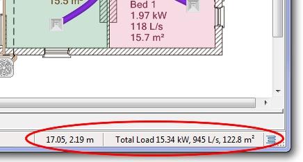 |
The total loads for all the zones you have created that are switched on are shown in the bottom right corner of the status bar. Depending on the options you have selected, this can be any combination of the heat loads, the required air flow rate, or the zone areas. If you select one or more zones, then the properties of your selection are displayed. The x and y coordinates of the cursor in the design canvas are also shown here.
Note that while you are drawing a load zone, you can use the keyboard undo and redo shortcuts [Ctrl] + Z and [Ctrl] + Y to correct mistakes made during the drawing process. Also, once you have drawn a load zone, you can add additional points by double-clicking with the Select Tool on the inside edge of the zone. Similarly, double clicking on an existing point will remove it. Zones (or walls) that are joined because they share one or more common points can be separated if you hold down the Control [Ctrl] key when you drag them.
You can select an option to label the zone directly with its name and properties you've chosen to display. You can also click and drag the zone's label to move it, and use the context menu item Set As Default Position to use that same label offset every time you add a zone.
Discontinuous load zones can be made by creating separate zones, selecting them,
and pressing the Join Zones toolbar button ( ). This tool
will connect all of the selected zones with corridors of zero width, resulting in a single zone.
). This tool
will connect all of the selected zones with corridors of zero width, resulting in a single zone.
Load zones should not overlap. Note that although it is possible to overlap the load zones, this will give invalid results. Also, you cannot create crossed polygons with the Set polygon load zone tool. If you draw a crossed polygon, no load zone will be created.
Setting the Design Mode (Evaporative, Refrigerated, Heating, etc.)
The design mode drop-down selector in this tool tab lets you select from the refrigerative ( ),
evaporative (
),
evaporative ( ), gas ducted heating (
 ),
ventilation (
),
ventilation ( ), hydronics (
 ), venturi
(
), venturi
( ), or lighting (
 ) design modes. Each mode has its own settings in the Design Options,
covering settings such as the load zone air flow rate and duct branch position maximum velocity limits, for example.
An icon showing the current design mode is also shown in the status bar, and can also be used to switch the design mode.
Some design modes, in particular the hydronics design mode, will show additional tools in the loads tool tab.
) design modes. Each mode has its own settings in the Design Options,
covering settings such as the load zone air flow rate and duct branch position maximum velocity limits, for example.
An icon showing the current design mode is also shown in the status bar, and can also be used to switch the design mode.
Some design modes, in particular the hydronics design mode, will show additional tools in the loads tool tab.
The venturi mode () is a special high-velocity, rigid-duct system, and
requires a separate licence module.
The lighting mode () shows
the required lumens for each zone and displays the light throw circles, and likewise requires its own licence module. Note that if you
are in the lighting mode, the shortcut key T toggles the lighting throw circles on and off.
You Can Automatically Design to Your Loads
The Automatic Design toolbar button ( ) will automatically
add the appropriate unit sized for your applied loads, connected to the correct outlets, sized for the air flow requirements of the load
zones in your design. The automatic design tool will create a design applicable for the current design mode. The unit added will be
chosen so that it has adequate cooling capacity for those load zones that are
currently switched on.
) will automatically
add the appropriate unit sized for your applied loads, connected to the correct outlets, sized for the air flow requirements of the load
zones in your design. The automatic design tool will create a design applicable for the current design mode. The unit added will be
chosen so that it has adequate cooling capacity for those load zones that are
currently switched on.
The designer will look to choose parts firstly from your Automatic Design option settings, then from your catalog Favourites, and lastly from anywhere in your loaded catalogs. The program will use the first suitable part it finds, so it is important to set your options or select your Favourites appropriately.
To design a system servicing only some zones, simply select the zones you want and the designer will design only for those zones. If no zones are selected, the designer will create a design supplying every zone in your design.
Ducting is sized according to the maximum flow rates for each duct position: main (duct connected directly to the unit), branch (between a main duct and a final duct, and final (ducting connected to an outlet).
The automatic designer does not currently support the ventilation, hydronics, or the lighting design modes.
A complete discussion of the automatic designer is given in the section How do I automatically lay out my design?
You Can Analyse Loads and Airflows
The Toggle Zones Table toolbar button ( ) can be used to
analyse your design. Each design mode has its own table display customised to that mode.
For the air conditioning modes, the results are displayed by solving for the
resultant air flow, and then displaying a table of all the load zones in
your design. The table also displays the results of the flow analysis of your design, comparing the required air with the actual
supplied air in each zone. This lets you see immediately if your design is adequate for the given loads. This also includes
airflows between different levels through Penetrations.
) can be used to
analyse your design. Each design mode has its own table display customised to that mode.
For the air conditioning modes, the results are displayed by solving for the
resultant air flow, and then displaying a table of all the load zones in
your design. The table also displays the results of the flow analysis of your design, comparing the required air with the actual
supplied air in each zone. This lets you see immediately if your design is adequate for the given loads. This also includes
airflows between different levels through Penetrations.
The Damper column shows an estimate of how open a damper controlling the flow to each zone should be to get the required flow. This figure is shown in red when the damper setting would need to be above 100%, because the supplied air flow is insufficient.
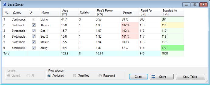 |
You can turn any Switchable zones on or off with the checkbox in the On column. Zones which are switched off do not receive any supplied air.
The supplied air values are colour coded to give immediate feedback on the cooling air levels. Full green indicates the requirements are met with at least a 12% buffer margin, pale green means the supply is adequate, yellow means the supply is within 12% of being adequate, and red indicates the air supply is inadequate.
The program provides three different solution methods: A fully analytical solution which takes into account flow pressure losses which is more accurate but slow, a simplified solution which does not take pressure losses into account but which is significantly faster, or a balanced solution which supplies exactly the flow required for each zone, regardless of the unit's actual output.
If you change your design or change which zones are switched on, you'll need to manually update the table by pressing the Solve button. You can copy the table to the clipboard with the Copy Table button if you wish to paste it into another document such as MS Word or Excel, for example.
Use the toolbar button Solve Air Flows ( )
if you want to run the same air flow calculations without first opening the Zones Table. This can be useful
when you wish to investigate flows through parts and see their outlet face velocities. You can view the results by
clicking on the parts and noting the values in the status bar, or by opening the context menu item Properties.
Air flows will only be reported after an air flow calculation has been done. If you then modify your design and
want to see the new airflow results, you will need to manually recalculate the flows using this button again.
)
if you want to run the same air flow calculations without first opening the Zones Table. This can be useful
when you wish to investigate flows through parts and see their outlet face velocities. You can view the results by
clicking on the parts and noting the values in the status bar, or by opening the context menu item Properties.
Air flows will only be reported after an air flow calculation has been done. If you then modify your design and
want to see the new airflow results, you will need to manually recalculate the flows using this button again.
(Note that if you use the Auto-size Ducts toolbar tool ( ), the duct flows will also be set to whatever flow is required to supply the specified zones regardless
of the output of your selected unit - and the ducting will be sized to handle that flow.)
), the duct flows will also be set to whatever flow is required to supply the specified zones regardless
of the output of your selected unit - and the ducting will be sized to handle that flow.)
The air flow calculations necessitate some simplifications, and are indicative results. You should perform your own detailed calculations if you require higher levels of accuracy.
Setting the Zone Order
You can click on any column header to sort the table by that property. You can also drag-and-drop rows to create your own custom order. If you manually change the order in this table, then that same order will be used when creating the zones table in the Report page (otherwise alphabetical order is used).
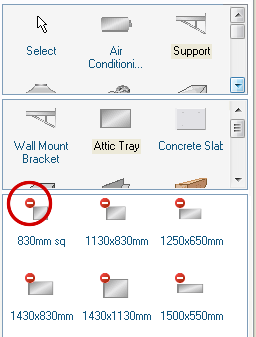
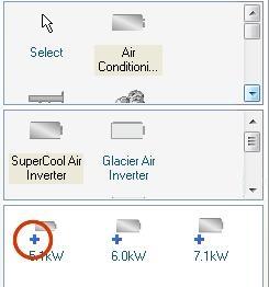
The Parts Tool Tab
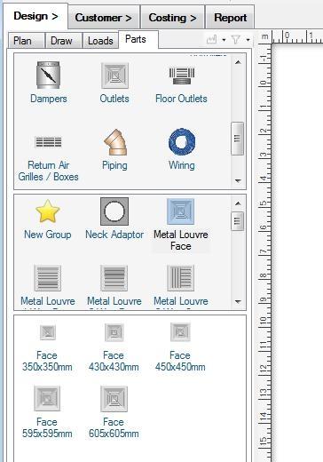 |
The Parts tab shows you a catalog of the parts you can put into the design canvas. The parts you see in this tab are the ones that are in the currently loaded catalogs, selected with the menu item Tools -> Select Catalogs. It is important to select catalogs that match the type of design you want to make, and the design mode you are using. For example, if you want to make a refrigerative design, you need to have a units catalog loaded that lets you place refrigerative air conditioning units. If you want to draw rigid ducting, you need to load a catalog such as the Generic Rigid Duct catalog that contains the rigid components that you want to use. If you want to do a lighting design, you need to load a catalog that has lights.
You can select parts at three levels, the part type (such as Diffuser), the part sub-type (such as Metal Louvre Face), and lastly the actual sized part itself. Parts can only be dragged into the canvas from the sized parts window (the bottom of the three windows). The bottom window has a white background to remind you of this. Hovering over an item in the catalog with the mouse will display more information about that part. Double left-clicking a part in the catalog will auto-insert it into the canvas without the need to drag it. Holding down the Control (Ctrl) key while dropping a part will put you in repeat-drop mode, where you can drop copies of that same part repeatedly.
Most parts are of fixed physical size. However some parts, usually symbols but also other specialised parts, have the ability to be resized in the same manner as a custom image.
Although you cannot modify the contents of the Catalog file itself, you can customise many aspects of how the Catalog is displayed, including setting your Favourites, and filtering the catalog.
Part Filters
When the Parts tool tab is selected, you will see the catalog filtering controls displayed:
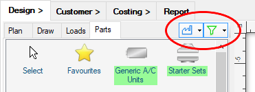 |
The Filter parts by manufacturer button allows you to see only the parts provided by particular manufacturers. Use the drop-down to check the manufacturers to display.
The Filter parts by connector button lets you easily find parts in the catalog that can connect to a currently selected part on the canvas. The drop-down controls give you access to the filter settings. For example, you can choose to highlight the compatible parts (shown with green highlighting), or to show only the compatible parts and hide all incompatible parts.
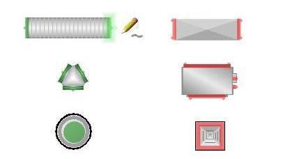
Symbols
Some catalogs are special symbol catalogs. A symbol is a special type of part that will not be added to the costing take-off list, but is only displayed as an image. Many symbols are also resizable. A symbol is identifiable in the canvas by its purple mouse-over glow highlight. You can also use the context menu item Change to Symbol to convert a normal part to a symbol, which is useful if you want to show parts that you do not want to be costed, for example an additional view of a particular construction.
Bring to Front, Send to Back
You can change the draw order of parts - that is, parts can be moved to be in front of or behind other parts
- by selecting them and using the Bring to front ( ) or the Send to back (
 ) toolbar buttons. (The same
buttons can also be used to reorder images). Note that ducting is always drawn underneath any other parts to keep the presentation clear.
) toolbar buttons. (The same
buttons can also be used to reorder images). Note that ducting is always drawn underneath any other parts to keep the presentation clear.
If you need to put a part or image behind everything else for any reason, you can check the context menu item Order -> Background layer ( )
for that item. Items in the background layer can still be ordered within that layer.
)
for that item. Items in the background layer can still be ordered within that layer.
Selecting Through a Stack
If you need to select a part that is drawn beneath another part, you can select down the image stack by simply clicking again on the selected part. The next part in the stack will then be selected.
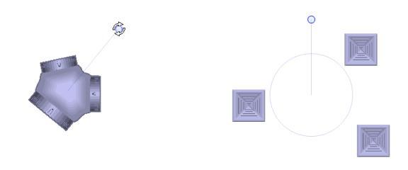
Rotating Selections
Any selected group of objects can be rotated as a group
using the Rotate Selection ( ) toolbar tool.
This can be particularly useful if you need to rotate an entire design so you can reuse it for a different house plan image.
You can also rotate objects or groups of objects using their rotation handles (see below).
) toolbar tool.
This can be particularly useful if you need to rotate an entire design so you can reuse it for a different house plan image.
You can also rotate objects or groups of objects using their rotation handles (see below).
Aligning and Spacing Selections
Any group of selected objects can be aligned or spaced using the Adjust Position
( ) toolbar tool.
This is particularly useful if you need to align a group of outlets or to space them regularly, for example.
) toolbar tool.
This is particularly useful if you need to align a group of outlets or to space them regularly, for example.
You can use the menu sub-items Align to Grid, or Resize Grid to space your selection into a regular grid layout.
You Can Edit Parts
 |
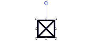
All parts can be selected and repositioned in the design canvas by clicking and dragging them. Most parts are rigid, and when selected are drawn with a rotation handle (the blue circle above the part), just as for a custom image. By dragging the rotation handle you can position the part at any angle you wish. The rotation will automatically snap-to a 90o angle, unless you hold down the Control key (Ctrl). To constrain the angle to a multiple of 45o, hold down the Shift key while rotating the part.
When you select multiple objects to rotate, a common rotation handle is shown which will rotate all of the selected objects about the centre of the selection.
If you have selected 3 or more parts, you can toggle between rotation or layout resizing of the selection with the R key.
 |
Any item or selection of items can also be flipped either horizontally (about a vertical axis) or vertically
(about a horizontal axis) with the menu bar flip tools ().
This can be useful when placing parts that aren't symmetrical, or when flipping an entire design, for example. If you want to
flip the rigid parts around their own centre lines while holding their positions constant, you can use the part's context menu
item Flip -> Reflect Rigid Parts ( ).
).
Double clicking on a rigid part in the design canvas will take you directly to that part in the catalog list box. You can do the same for any part - rigid or user-drawn - by selecting the context menu item Find in Catalog.
Some Parts Are Resizable
Most symbols and some parts can be resized. Any part that can be resized will have white resize handles () on the sides
or corners showing which directions can be modified. Some parts can only be made smaller, some larger, and some either smaller or larger.
 |
You Can Edit Labels
You have complete control over how part labels are shown. You can reposition a part's label the same way you would a rigid part - by clicking and dragging it. Hovering the mouse over a label will make the label glow, and it will show which part the label refers to with a leader line.
 |
A part's label can also be rotated using its rotation handle, in the same way you would rotate a part. If the label belongs to a flexible duct, you can double click on the label's rotation handle to centre the label on the duct.
You can edit the text, font, or colour of any part's label in the design canvas either by double clicking on the label, or by selecting Edit Label from the part's context menu. The Design Options give you control over which labels are shown (e.g. only for drawn parts such as ducting, for all rigid parts). If you require even finer control you can also set the display of each label individually with the context menu option Show Labels. You can choose to always show a label, to show it according to the Options settings you have specified (the default), or to hide it unless the part is selected (a part's label will always be shown when it is selected).
A part's label text can also be customised by editing them directly in the Catalog, which will affect all instances of that part added to the design canvas. You can also customise the default display setting of each part in the Parts catalog with the catalog context menu option Show Label in Canvas.
For some specialist parts, notably some lights, the label can consist of a part that you can edit, and a part that the program has generated to indicate how it is connected. In this case you can only edit the first part of the label.
Note that you can directly toggle all displayed labels off and on with the toolbar button Hide Labels
( ).
).
Labels Can Have Dynamic Tags
You can make labels that display a part's data dynamically on the canvas. In the Edit Label dialog, clicking on the Insert Field drop-down arrow (circled below) will show you the type of data that you can insert into a label:
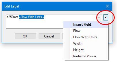 |
The name of the data field will be shown as a tag between the special characters: << and >>, and this field will be updated dynamically on the canvas. In this way you can display a part's size or air flow in that part's label, for example. You can also make multi-line labels in this dialog.
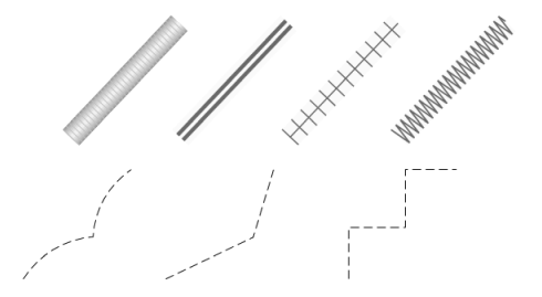
You Draw Some Parts Yourself
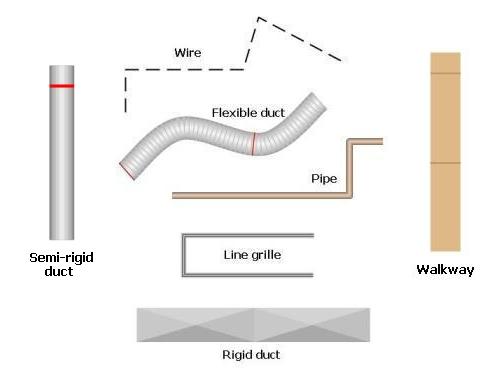 |
Some parts, such as ducting, pipes, line grilles, wooden walkways, and wires can be drawn by the user and have arbitrary shapes and lengths. They can be dragged
into the canvas as a unit length, or, more conveniently, you can use their draw tools to lay them out wherever you like. Drawn parts
can have their lengths shown in their labels, controlled by an Options setting.
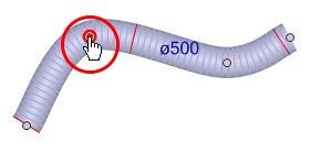
Note that the duct is drawn with a red line indicating the end of a length, where a joiner is required. For flexible duct, you can use
the Toggle Joiners ( ) toolbar tool to automatically add joiners at
these points. Some drawn parts, such as round rigid ducting, have sticky lengths where the duct will snap-to whole lengths while you are
drawing or editing them. Pipes (and pipe fittings) can be drawn wider than their actual diameter to make them more easily visible (5 times wider by default).
Rigid ducting is drawn with one sheet metal cross fold between each handle point - to add more sections, simply double click to add
more handle points (see below).
) toolbar tool to automatically add joiners at
these points. Some drawn parts, such as round rigid ducting, have sticky lengths where the duct will snap-to whole lengths while you are
drawing or editing them. Pipes (and pipe fittings) can be drawn wider than their actual diameter to make them more easily visible (5 times wider by default).
Rigid ducting is drawn with one sheet metal cross fold between each handle point - to add more sections, simply double click to add
more handle points (see below).
 |
A user-drawn part that has a draw tool is indicated by drawing its part icon with a pencil overlay, as shown. By single clicking on this part without dragging it, you will select the draw tool which can be used in the design canvas to draw the part where you wish. To draw a flexible or rigid duct, simply left-click and drag the mouse. To draw a line grille, walkway, wire or piping, perform a series of left-clicks with or without dragging. To finish, click on the end of the segment again. Use a right-click or use the undo keyboard shortcut [Ctrl] + Z to undo a point while you are drawing.
Any tool can be cancelled at any time by hitting the Escape (Esc) key. As with most tools, you can toggle between the current drawing tool and the Select tool by briefly tapping either the Ctrl, Shift or Spacebar key. Help for each tool is shown in the status bar when you change to that tool.
 |
User-drawn parts have handle points defining their shape which are visible when the part is selected. You can drag a handle to adjust the shape or length of the user-drawn part, as shown. Double left-clicking on a handle will delete it, as will hitting the Delete key while the handle is active. Double clicking on a selected user-drawn part where there is no handle will add a new handle at that point. Handle points can also be added and deleted using context menu items, available by right clicking on a drawn part. The context menu item Delete All Handles will remove all the extra handles in a drawn part, which is a quick and easy way to make all your ducting perfectly smooth.
User-drawn parts can also be drawn in colour. The colours may be defined in the parts catalog, but you can also define your own colours by customising your catalog. User drawn parts in the canvas can also have their individual colour specified using the context menu item Set Colour, overriding the colour defined in the catalog.
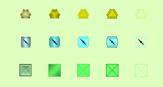
Parts Can Have Different Draw Styles
Most parts, including rigid parts, drawn parts, and rigid ducting can be drawn in a number of different styles (and colours). Use the context menu item Draw Style to customise how you want your design to look.
 |
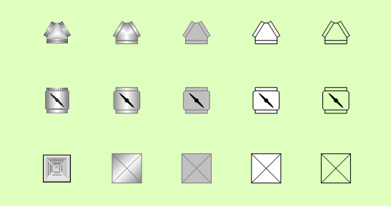 |
The draw style can be set either for the general type of part (with the canvas context menu item Default to selected style), or for each specific part in the catalog (with the catalog context menu item Edit Catalog Draw Style).
 |
The draw style does not affect the properties of any part, with the exception of wires. The wire length will be calculated differently for each style, to match how it is drawn: as arcs, as straight lines, or as rectangular lengths.
You Can Set the Colours of Parts
Most parts, including rigid parts, drawn parts, and rigid ducting can also be drawn in the colour of your choice with the context menu item Set Colour. How the colour is applied also depends on the draw style you have chosen.
 |
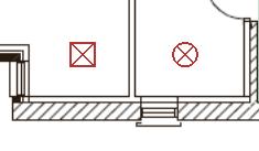
Some Parts are Not Printed
 |
Some parts are neither printed nor drawn in the report diagram because they would make the design less clear. Any part which is
drawn on the design canvas but is not printed in the final diagram is shown with the small red not-printed
symbol ( ) in the catalog.
 |
Those parts that are not printed are shaded red on the design canvas. You can also select parts on the canvas instead of the catalog and make them not printed by selecting the context menu item "Hidden when Printing".
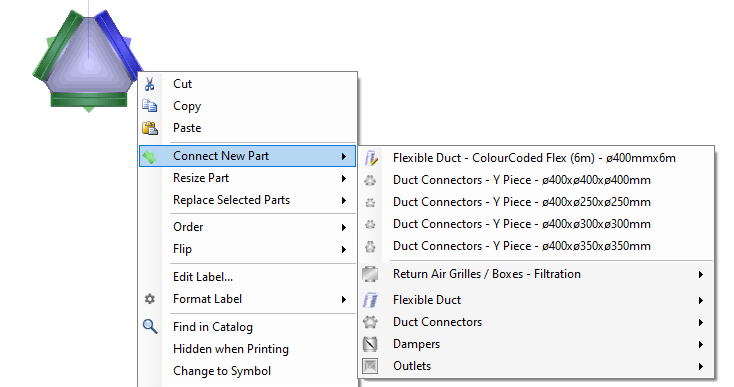
Some Parts Automatically Add More Parts
 |
Some parts must always be supplied with certain other parts that always go with them,
for example many fan coil units must have the correctly sized condenser unit
added at the same time. Parts that will come with one or more other parts are shown
with the small blue has added parts symbol ( )
in the catalog. You can override this and drop a part without
adding any other parts by holding down the [Alt] key while dropping it. In
addition, some parts can be automatically added conditionally - that is, they are only
added if some specific design condition is met.
)
in the catalog. You can override this and drop a part without
adding any other parts by holding down the [Alt] key while dropping it. In
addition, some parts can be automatically added conditionally - that is, they are only
added if some specific design condition is met.
You Can Set Your Own Auto-Added Parts
You can customise your catalogs by specifying yourself which additional parts should be automatically added with each part. By selecting a group of parts and choosing the context menu item Auto-Add These Parts To you can attach the selected parts to a master part. The master part can be any other unselected part in your design. When you next add this part, the selected items will also be added. The added parts will keep their same relative positions to the master part, and also the same depth order (on top or behind the master part).
Note that user-defined added parts are added in addition to any added parts which are defined in the catalog. Your customised auto-added part rules are stored in your Catalog Edits file, and it is possible, in principle, to edit this file to fine-tune your rules if required.
User-defined added parts can also be removed from the catalog parts with the context menu item Remove Auto-Add Parts, but added parts that are defined in the catalog can not be removed in this way.
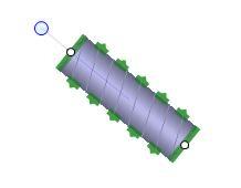
Parts Can Snap-Together
Many parts that you add to your design also have the ability to snap-to (connect with) other parts. Connections are shown in green if the part or tool that is being manipulated can connect to it, or red if it cannot. Connections that glow green indicate that those parts have locked onto each other, and if you complete your action at that point, the parts will snap together.
If you are moving a part that does not have the right sized connectors to be compatible with a second part, the part you are moving will try to resize itself (if your catalogs contain the appropriate parts) to match the second part.
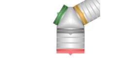
To be a compatible connection, both connectors must have the same size, shape, and (if defined) thread - although a single connection can be made to match multiple sizes. A connection's shape can be either circular or rectangular. A part may have connections that are angled perpendicular to the canvas, or they may lie in the plane of the canvas, and this may affect which other parts it can connect to. A flexible duct, for example, can bend to connect to either.
 |
You Can Break Connections
At any point hold down the Control key (Ctrl) to move a part without snap-to. Connections that have already been made can be broken by holding down the Control key while you drag a part away. Otherwise moving a part will likewise move all the parts that are connected to it. Opening the context menu on a part with connections will also display options to directly connect a new matching part from your active catalogs, or to break all existing connections.
Connections Are Highlighted
Selecting a part in the catalog will highlight all of the compatible part connections in your design. The colour of a connector indicates if it can connect to the part you have selected, as shown:
 |
Use the "Check Design" Toolbar Tool to Check Your Design
Connections that are not yet joined can be made to light up in red by pressing the Check Connections toolbar button ( , or by pressing C), showing where your design may be unfinished. Zones are also highlighted to indicate if their air flow is adequate. Zones outlined in green have sufficient air, those outlined in yellow have almost sufficient air, and those outlined in red have insufficient air. If you want to re-check a modified design and are using the analytical
airflow solution (which can take a significant length of time to solve), you have to manually
use the Solve Air Flows tool
() to recalculate the airflows. The results shown will be those
from last air flow solution performed, even if your design has since changed. If you are using the (faster) simplified airflow solution,
the airflows will be recalculated every time you check your design.
, or by pressing C), showing where your design may be unfinished. Zones are also highlighted to indicate if their air flow is adequate. Zones outlined in green have sufficient air, those outlined in yellow have almost sufficient air, and those outlined in red have insufficient air. If you want to re-check a modified design and are using the analytical
airflow solution (which can take a significant length of time to solve), you have to manually
use the Solve Air Flows tool
() to recalculate the airflows. The results shown will be those
from last air flow solution performed, even if your design has since changed. If you are using the (faster) simplified airflow solution,
the airflows will be recalculated every time you check your design.
Which checks are performed are determined by the active Tool-tab. If you are in the Loads tab, then only the loads highlighting is done. If you are in the Parts Tool-tab, then only the connectors are highlighted. If you are in any other Tool-tab, both the connectors and the loads are checked and highlighted.
The air flow calculations performed by Plandroid are simplified and you should perform your own analysis if you require a more detailed solution.
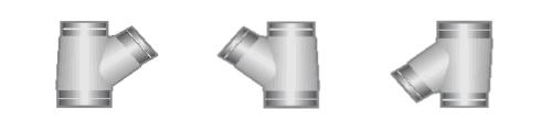
You Can Design With Rigid Ducts
Commercial designs often require rectangular rigid ducting. Plandroid supports user-drawn rigid ducting as well as adding rectangular sections and various rectangular connectors. Airflow calculations are also performed for rectangular ducting, and for this the ducting depth is required. The cross-sectional size of any rectangular duct can be set by selecting those rectangular sections and using the context menu item Set Duct Dimensions.
A wide range of rigid connectors are available which can be dimensioned to any sizes that you need. For example, a Rectangular Reducer can transition between different duct depths, or a Rectangular Depth Reducer can be used to keep the same duct width while only changing the duct depth. If you set the depth of a reducer, you can set the inlet depth and the outlet depth independently. Rectangular Transforms can be used as a starter set to connect a unit to a rectangular duct.
Most rigid ducts can also be resized by using their resize handles () – one at each end for simple
ducts, and one for each geometrical parameter for more complicated rigid parts.
 |
Rectangular rigid ducting can also be costed based on the material used in the ducting instead of on a per-part basis. For a complete discussion on designing with rigid ducting, see How do I design with rigid ducts?
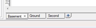
Using Multiple Plan Levels
Along the bottom of the design canvas are the level tabs - one tab for each level. You can add additional building levels by pressing the blue "+" (Add level) button at the end of the tabs row. Tabs can be closed (with the "x" close button), renamed (double click the tab), or even re-ordered (drag and drop the tab).
 |
Opening a context menu on the levels tabs also allows you to add, delete, rename, move or copy a level, or to set the background colour of the tab.
Note that a level can be aligned
relative to the level immediately below it with the Plan -> Align Levels tool ( ) so that penetrations can be laid out
accurately. Penetrations are drawn in red when they are projected from a higher level onto a lower level.
) so that penetrations can be laid out
accurately. Penetrations are drawn in red when they are projected from a higher level onto a lower level.
 |
Ducting connections can join different levels through penetrations, and the air flow calculations handle flow between levels.
The Show Lower Level toolbar button ( )
will appear when you have multiple levels, and can be used to display the lower level at any time. The button
has an associated drop-down slider bar that can dynamically control the overlay transparency.
)
will appear when you have multiple levels, and can be used to display the lower level at any time. The button
has an associated drop-down slider bar that can dynamically control the overlay transparency.
Hotkeys
In addition to the hotkeys for the menu controls, the following hotkeys can be used in the Design page:
| Key | Action |
|---|---|
| + | Zoom in |
| - | Zoom out |
| 0 | Zoom to fit |
| 1 | Switch to the Plan tool tab |
| 2 | Switch to the Draw tool tab |
| 3 | Switch to the Loads tool tab |
| 4 | Switch to the Parts tool tab |
| [Arrow key] | Pan canvas in arrow direction |
| [Space bar] | 1) Pan canvas by dragging left mouse button; 2) Tap to toggle between the Select tool and the last used draw tool |
| B | Send the selection to the back |
| C | Check design (hold down to highlight loose connections and show zone air supply) |
| F | Bring the selection to the front |
| G | Toggle the snap-to grid display on and off |
| H | Show the heat flow in the hydronics pipes (Hydronics design mode only) |
| J | In the Loads tab: Join selected zones ([Ctrl] + J to split zones); in the Parts tab: Toggle joiners |
| L | Toggle the labels display on and off |
| P | Show the plan image only (hold down to hide everything else) |
| [Shift] + P | Hide the plan image (hold down to hide the image) |
| R | Toggle a selection of 3 or more parts between rotate and resize modes |
| T | Toggle the selected light throw circles display on and off (Lighting mode only) |
| X | Flip the selection in the X-direction (horizontally) |
| Y | Flip the selection in the Y-direction (vertically) |
| [Esc] | Cancel tool, cancel draw action, or cancel selection |
| [Delete] / [Backspace] | Delete selection |
| [Ctrl] | 1) Toggle select; 2) Multi-drop mode on part drop; 3) Override snap-to on draw or edit; 4) Break connections on item drag; 5) Tap to toggle between the Select tool and the last used draw tool |
| [Alt] | 1) No adding other parts on part drop; 2) Toggle door opening side on draw door |
| [Shift] | 1) Constrain tools or part rotations to multiples of 45o; 2) Tap to toggle between the Select tool and the last used draw tool |
| [Caps Lock] [Num Lock] [Scroll Lock] |
Lock key to disable snap-to in editing. Holding [Ctrl] then enables snap-to. Which key to use is an option setting. |
| [Ctrl] + F | Find part in catalog |
| [Ctrl] + [Alt] + F5 | Display the location of your configuration file in the status bar (advanced use only) |
| [Ctrl] + [Alt] + F12 | Reset all application settings |
The next page is the Customer page.